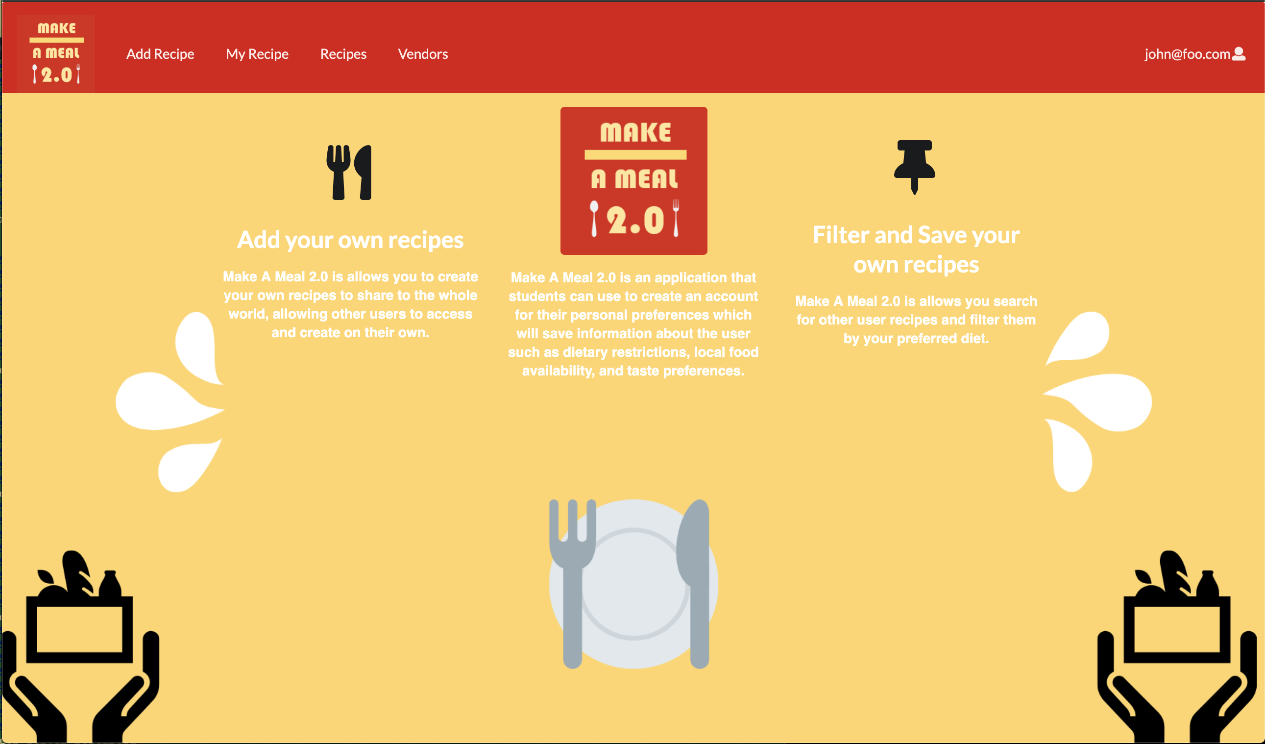
Make A Meal 2.0: A Pretty Looking Thing I Helped Make
Link to the project: Make A Meal 2.0
Project Info Page: https://make-a-meal-2-0.github.io/
Github Project Page: https://github.com/make-a-meal-2-0/mam2
My Experiences in Developing This Project
When looking at the project, I take into account the amount of UI design I had to do. I started off with having a vague idea of how to design these pages. It started with changing the background constantly early with a color of brown but then ending with a result with a color pallette. I also ended up having to learn how to deal with Simple Schemas in the project so that I would have a group of ingredients be displayed along with their corresponding recipe cards and pages. Communication wasn’t that bad between team members as all of us managed to put in our own efforts into this project.

Oh yeah, I really should have done that...
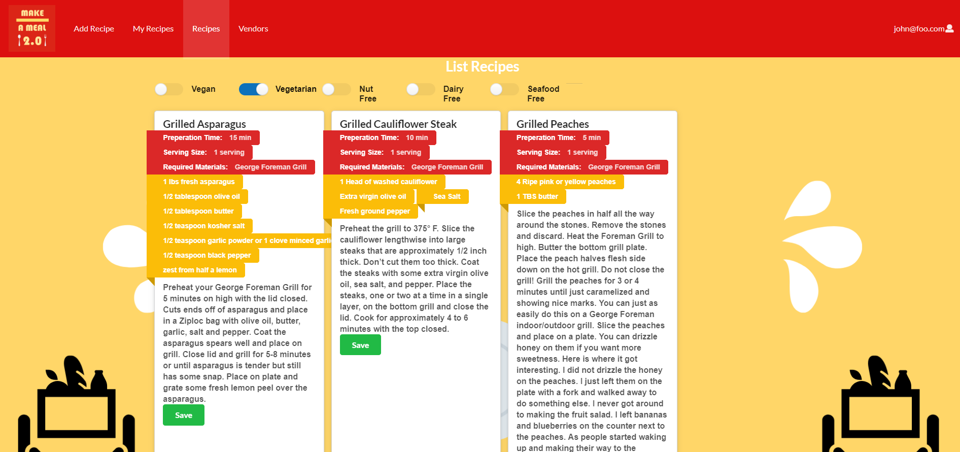
So there was a piece of advise I received in the process of developing this. It was that it would have really been nice to just code the User Interface bits such as buttons, footers, navbar placement and such, for the reason that we would have something nice to look at and work with beforehand rather than coming up with things on the fly. Let us look at the recipe list for example:

Another bit was attempting to figure out before hand how to sort out the data. This was difficult as we decided that having seperate schemas was a better way to go too late. To adapt to this we had this awkward functionality that the user had to deal with in the add page where they had to put the name of the recipe they were adding as a form of “confirmation” in order to have the ingredient be displayed along side the recipe in the recipe pages.
